MD Live

MD Live is a telehealth company that gives patients convenient access to medical and mental health services. Through MD Live, patients can have virtual consultations with doctors, psychiatrists, dermatologists, and counselors.
The Problem
As MD Live continues to grow, how can we update our scheduling experience to support future features, incorporate the latest design system components, and ensure it meets accessibility standards?
Our Solution
After reviewing the current experience, the team determined that updating the checkout process would be the best starting point, as it impacts all parts of the user workflow.
Our Tools
Figma, FigJam, UserZoom, JIRA, Confluence
The Timeline
10 weeks
My Responsibilities
Design Strategy
User and Product Research
User Flows
Wireframes and Prototypes
High Fidelity Mockups
Usability Testing
Handoff Discussion and Review
Accessibility Review
Design QA Review
Our Approach
As part of a company-wide initiative aimed at continuous improvement, I took the lead in redesigning the checkout and payment process for our appointment scheduling on our patient platform on web and mobile native. This involved streamlining the user experience, identifying pain points, and implementing design solutions to enhance efficiency, reduce friction, and improve overall user satisfaction.
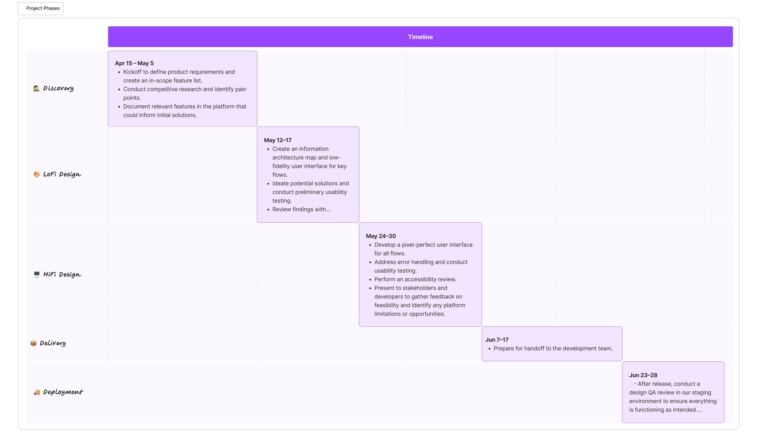
I collaborated with stakeholders to create a detailed timeline that aligns with a five-phase design process.
During the discovery phase, I conducted thorough competitive research and analysis to understand industry trends and identify best practices. Afterward, I presented these findings and designs to stakeholders for feedback and alignment. We collaborated to also identify pain points, defined requirements, and outlined features for phased implementation.

I worked hand in hand with stakeholders to discover user needs and identify opportunities.
After reviewing with the team, we identified several key takeaways:
We found inconsistencies in how we communicated and presented various scheduling options.
There were multiple versions of components and styles, which resulted in accessibility issues.
To support future features like skipping payment, scheduling multiple visits, and others, we needed to redesign the checkout page.
Mapping the User Flow
During the Low Fidelity phase, I started by conducting research, which helped shape the initial user flow to map out the user journey. I then created a simple, high-level flow that highlighted key steps, such as selecting an appointment, choosing a provider, and completing payment.
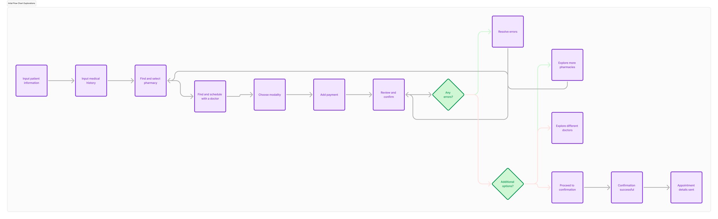
An initial user flow outlining the key steps in the user journey, from entry point to task completion.
Finding Solutions
As I created wireframes, I tested them with real users to identify any pain points. Based on their feedback, I refined the flow to improve usability and accessibility. Users highlighted the need for a simpler process with fewer required fields and less text to read. They also wanted clear instructions on what steps to take and the ability to easily review their information on the page.

Detailed user flow outlining the steps in the patient checkout experience for one of our number of appointment types.
As I refined my design, I moved to high-fidelity wireframes and gathered more user feedback utilizing UserZoom, which was key in simplifying the checkout page. Through usability testing, I found that many users were confused by the cluttered layout and unclear instructions during the payment process. Several users expressed frustration over not knowing what information was needed or how to proceed, which led to higher abandonment rates. Based on this feedback, I simplified the design by removing unnecessary elements, clearly labeling required fields, and adding tooltips and progress indicators. I also restructured the layout to focus on key actions and reduce cognitive load. These changes made the checkout process more intuitive, informative, and user-friendly, ultimately improving conversion rates and user satisfaction.

New design system components to be integrated into the platform.

These mockup shows some of redesigns for the scheduling and checkout experience.
As the project neared completion, I focused on building reusable components for the design system to ensure consistency and scalability across the app. I then created high-fidelity wireframes to bring the design to life, incorporating branding, typography, and refined UI elements. Once the wireframes were ready, I developed an interactive prototype to simulate the user flow and tested it with real users to identify any remaining usability issues. Based on the results, I made final tweaks to improve the experience. After refining the designs, I facilitated a discussion and review with the design team, stakeholders, and engineers, moderating feedback to align on any last adjustments. This collaborative review ensured that all perspectives were considered, and the design was ready for development, meeting both user needs and business objectives.
Lessons Learned
I believe user feedback is crucial because it reveals how people interact with the product and where they encounter challenges. In this project, feedback highlighted specific issues with the checkout page, which was a key part of the scheduling process. By addressing these concerns, I was able to redesign the checkout experience to make it more intuitive and user-friendly. These improvements not only resolved pain points but also led to more positive reviews of our platform. This success has also opened the door for implementing new features, further enhancing the overall user experience.